Google Data Studio is getting more popular nowadays and many marketers have found a new best friend. Gartner predicts that by 2019, 23% of companies will be using DaaS (Desktop-as-a-Service) for agile analytics to support business users. If you are one of these marketers who would like to master Google Data Studio and become the Master, this guide could help you a lot.
It is a tool that allows you to create dashboards and reports that are fully customizable and interactive. As easy as drag and drop, you can set up the report panel the way you need. Whether you’re seasoned analytics professional or new to web analytics, you should know what Google Data Studio is and how it can help you make sense of your businesses’ data.
Google Data Studio is one of the most powerful and versatile Google products that you probably have ever seen. It was built to help marketers and business owners display their data in an interactive, visually appealing way.
This article will provide you with everything you need to know about Google Data Studio, including what it is and how you can use it for your business.
What is Google Data Studio?
Google Data Studio is a free reporting tool built to help marketers and business owners create beautiful data visualizations. It is part of the Google Marketing Platform (GMP) and allows users to pull data from several different sources, including Google Analytics, AdWords, DoubleClick, BigQuery, Sheets, Forms, and Data Transfer.
The goal of Google Data Studio is to give users the tools necessary to create their customized dashboards which can be shared online or exported as PDFs or PowerPoint slides. The dashboards can be used for anything from sales presentations to client reporting.
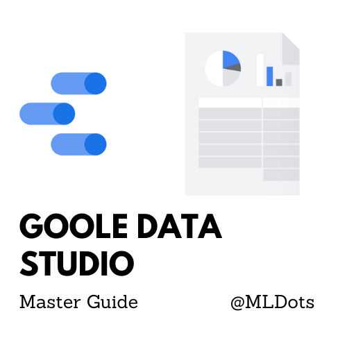
The tool sports an easy-to-use interface and provides a multitude of options for configuring and styling your reports—including the ability to choose from 22 chart types, 44 different map templates, and 34 visualization options.
Here are some tips to help you get the most out of this powerful platform:
Use preconfigured templates. One of the most time-consuming parts of creating reports is deciding how you want to display your data. With Data Studio, the hard work has already been done for you. Under the “Visualization” tab, simply select one of the preconfigured templates and then customize it how you see fit. This can save hours when compared to creating a similar report from scratch using tools such as Excel or Tableau.
The best part about Data Studio is that it’s completely free! Yep, there are currently no fees for using the tool. However, you do have to have a Google account but this is free as well!
As the tool has been around for some time now, there is a huge online community of users helping one another out with tips and tricks. This post will give you an overview of the tool as well as a few pro tips that will help you get started.
Some companies that are using Google Data Studio are:
Johnson Controls
Live Nation
Nexstar Media Group
NVIDIA
Best Buy
Here’s a step-by-step guide for creating simple reports in Google Data Studio using data from your Google Analytics account.
- Sign in to Google Data Studio
- Select Create > Reports
- In the report editor tool, add data either connect to data or my data source. In connect to data you can select a connector to create a new data source while in my data source you can add an existing data source for your reports.
- Do a data check after connecting data. It appears like the table to view the data.
- Once comfortable with data, start by adding charts. In the toolbar, click add charts.
- Select your chart, choose your variables, modify its looks and placements.
- Done add this to your story and style it. Continue adding charts to complete the story.
- Add banner and title to your report.
Detailed steps are present in the Google Help link here. Above I have summarized it in 8 simple steps further we will see different chart types, connectors, advanced options, and the famous template of Google Data Studio.
Google Data Studio Charts :
Google Data Studio offers a variety of chart formats, allowing users to create and design reports in a variety of ways. Let’s see some of the important charts.
- Time Series Chart
- Horizontal Bar Chart
- Score Card Chart
- Geo Map Chart
- Stock Area Chart
- Donut Chart
You find these important plus an entire suite of Google Data Studio charts here to play around and choose the one relevant for your use case.
Google Data Studio Connectors:
Connecting to data brings life to your reports, as of now there are 20 Google connectors to support your data and 479 Partner Connectors. To mention a few :
- Amazon Redshift
- BigQuery
- Google Analytics
- Microsoft SQl Server
- Google Sheets
- MySQL, etc
You can find the entire list here. Connecting them is very easy and intuitive.
Now let us see the few advanced options that might come as quick help to you in Google Data Studio.
- Custom API : You can make unique data connections to online APIs and incorporate your custom chart kinds for developers.
- Data Blending: To achieve a more cohesive perspective of your data, combine data from numerous sources. More details here
- Calculated Field: You can use calculated fields to generate new metrics and dimensions based on your data. More details here
There are many great examples of powerful Google Data Studio dashboard templates. Here below are a few :
KPI Snapshot by Amazee Metrics
More examples here
Conclusion
Google Data Studio is a data visualization tool that allows users to create interactive dashboards, reports, and visualizations to communicate insights. It has no limits regarding the team that can create these reports, having roles for a variety of users. Data Studio is an excellent reporting tool for marketers who need to share analytics with colleagues or clients. So, would I recommend Google Data Studio? You bet. It’s a great tool for anybody with the need to create beautiful visual reports, and I’ll certainly be using it more in the future to help us report our analytic metrics at Social Report. For more such content visit MLDots.